FITA Magazine Vol. III / Star Portraits
Erica Dorn
Interview by Francisca Gigante
and Francisco Teles da Gama
![]()
Erica Dorn’s imagination and creativity never cease to amaze us. We met the Japanese-born London-based graphic designer and illustrator, who specializes in creating bespoke visual worlds grounded in engaging stories and thorough research. Erica Dorn opened the door and unveiled her more than ten years of illustration and art direction work.
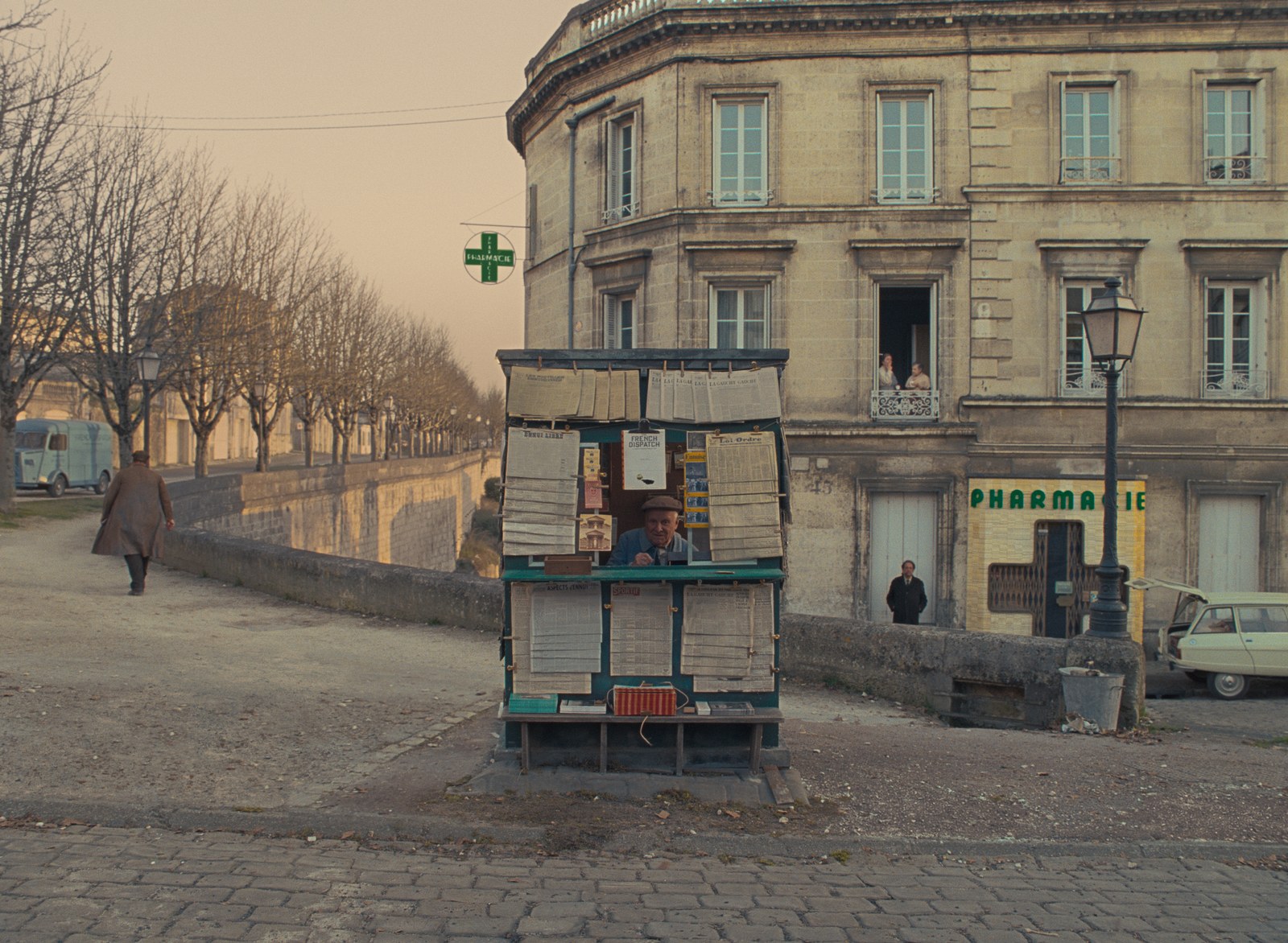
Her past clients range from small family businesses to global brands and organizations. Most recently, she worked with Wes Anderson on the Oscar-nominated stop-motion animation Isle of Dogs (2018) to create over 1,000 pieces alongside her team. Shortly after, she worked on Anderson’s latest acclaimed film based in the fictional city of Ennui-sur-Blasé, The French Dispatch (2021) which pays homage to The New Yorker magazine.
The film is an anthology comedy-drama, centered around a team of journalists running a fictional magazine, The French Dispatch, which started as a supplement to the equally fictional The Liberty, Kansas Evening Sun newspaper.
In both cases, Erica Dorn made sure that no detail was left to chance. She designed graphics for props and set dressing as well as typography for titles and credits. Now, we will get to know more about her research work and original visuals.
![]()
![]()
![]()
![]()
Early in your professional career you had the opportunity to work with luxury brands such as Hermès and Louis Vuitton. What are your biggest inspirations in the fashion world for the creation of illustration and graphic design projects?
I think that with fashion, as with all brands, it’s important to look at the origins of the brand and to its core personality and values. For Hermès we really wanted to draw out the playfulness and quirkiness inherent in the brand, and not be afraid to be a little absurd and experimental. With Louis Vuitton it was all about embracing the spirit of adventure and love of travel.
![]()
![]()
We know how enchanting Wes Anderson’s cinematic world is, where everything works in complete harmony. How does it feel to give life to such a rich imaginary?
Often as graphic designers we’re honing in on very specific details. It seems strange but sometimes we don’t see the things we design in context (and how they’re working with the whole) until we see them on screen, or at the very last minute when a set is completed, just before it’s shot. In those moments it feels like when you’ve been busy working on tiny puzzle pieces, and you finally take a step back to see the bigger picture. The harmony comes from the director and production designer, and in us being able to understand their vision – often given in very few words and an abundance of reference imagery – and being able to translate that into visual pieces that fit in perfectly with the rest. It takes a lot of training and sometimes a lot of revising and re-doing.
![]()
The last film you worked on, The French Dispatch, is inspired by comic books. Did you draw ideas and perspectives from any particular author or style?
Actually, the French Dispatch is heavily inspired by the New Yorker magazine and its writers. We were very lucky to have Javi Aznarez, a very talented illustrator, on board with us to lend a distinct look and personality to the Magazine. He became to The French Dispatch what Saul Steinberg was to The New Yorker. Many of the illustrations that appear in the bureau are done by him.
![]()
Erica Dorn
The French Dispatch
Lead Graphic Designer
Interview by Francisca Gigante
and Francisco Teles da Gama

Erica Dorn’s imagination and creativity never cease to amaze us. We met the Japanese-born London-based graphic designer and illustrator, who specializes in creating bespoke visual worlds grounded in engaging stories and thorough research. Erica Dorn opened the door and unveiled her more than ten years of illustration and art direction work.
Her past clients range from small family businesses to global brands and organizations. Most recently, she worked with Wes Anderson on the Oscar-nominated stop-motion animation Isle of Dogs (2018) to create over 1,000 pieces alongside her team. Shortly after, she worked on Anderson’s latest acclaimed film based in the fictional city of Ennui-sur-Blasé, The French Dispatch (2021) which pays homage to The New Yorker magazine.
The film is an anthology comedy-drama, centered around a team of journalists running a fictional magazine, The French Dispatch, which started as a supplement to the equally fictional The Liberty, Kansas Evening Sun newspaper.
In both cases, Erica Dorn made sure that no detail was left to chance. She designed graphics for props and set dressing as well as typography for titles and credits. Now, we will get to know more about her research work and original visuals.


Early in your professional career you had the opportunity to work with luxury brands such as Hermès and Louis Vuitton. What are your biggest inspirations in the fashion world for the creation of illustration and graphic design projects?
I think that with fashion, as with all brands, it’s important to look at the origins of the brand and to its core personality and values. For Hermès we really wanted to draw out the playfulness and quirkiness inherent in the brand, and not be afraid to be a little absurd and experimental. With Louis Vuitton it was all about embracing the spirit of adventure and love of travel.

We know how enchanting Wes Anderson’s cinematic world is, where everything works in complete harmony. How does it feel to give life to such a rich imaginary?
Often as graphic designers we’re honing in on very specific details. It seems strange but sometimes we don’t see the things we design in context (and how they’re working with the whole) until we see them on screen, or at the very last minute when a set is completed, just before it’s shot. In those moments it feels like when you’ve been busy working on tiny puzzle pieces, and you finally take a step back to see the bigger picture. The harmony comes from the director and production designer, and in us being able to understand their vision – often given in very few words and an abundance of reference imagery – and being able to translate that into visual pieces that fit in perfectly with the rest. It takes a lot of training and sometimes a lot of revising and re-doing.

The last film you worked on, The French Dispatch, is inspired by comic books. Did you draw ideas and perspectives from any particular author or style?
Actually, the French Dispatch is heavily inspired by the New Yorker magazine and its writers. We were very lucky to have Javi Aznarez, a very talented illustrator, on board with us to lend a distinct look and personality to the Magazine. He became to The French Dispatch what Saul Steinberg was to The New Yorker. Many of the illustrations that appear in the bureau are done by him.
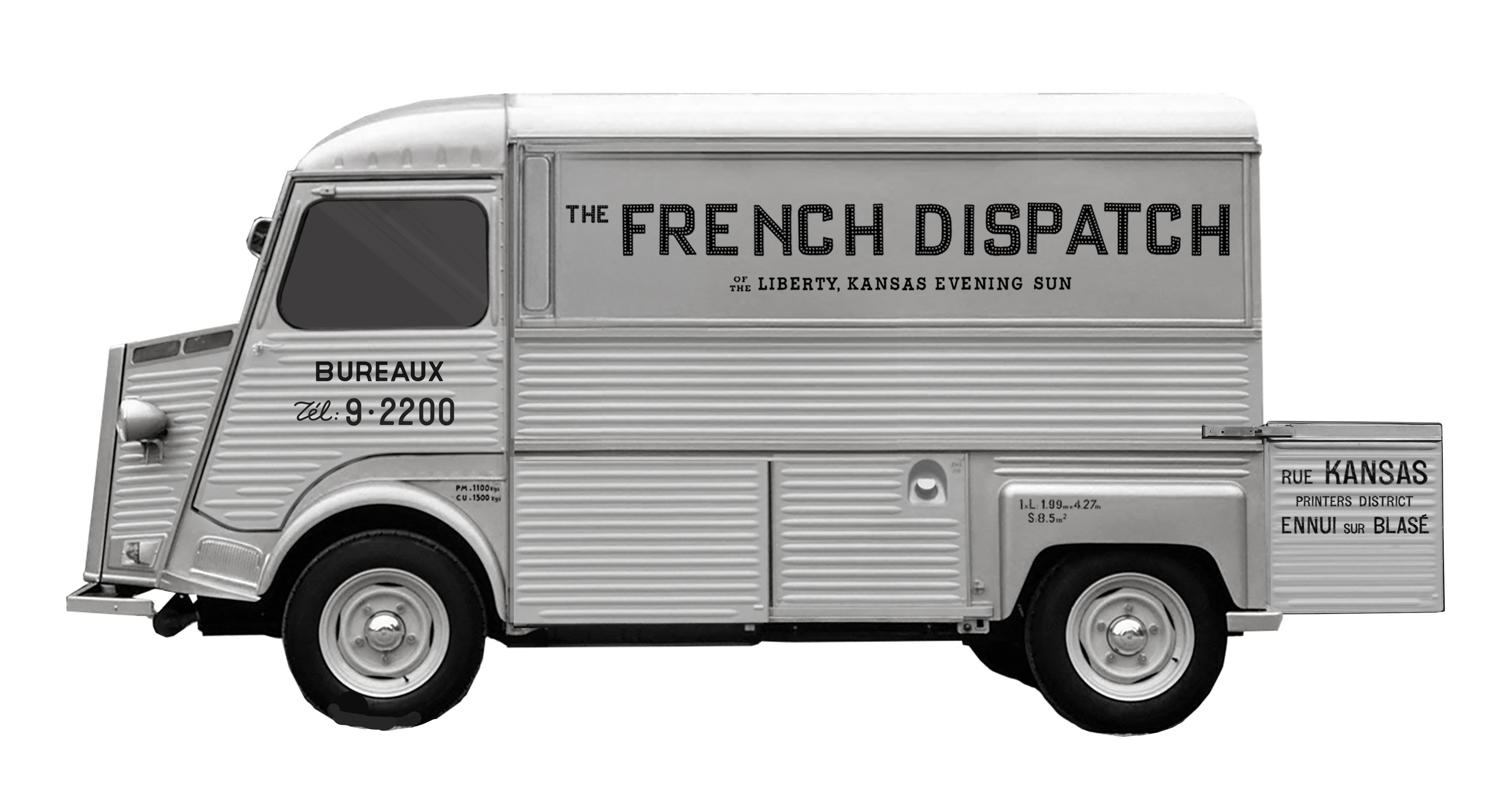
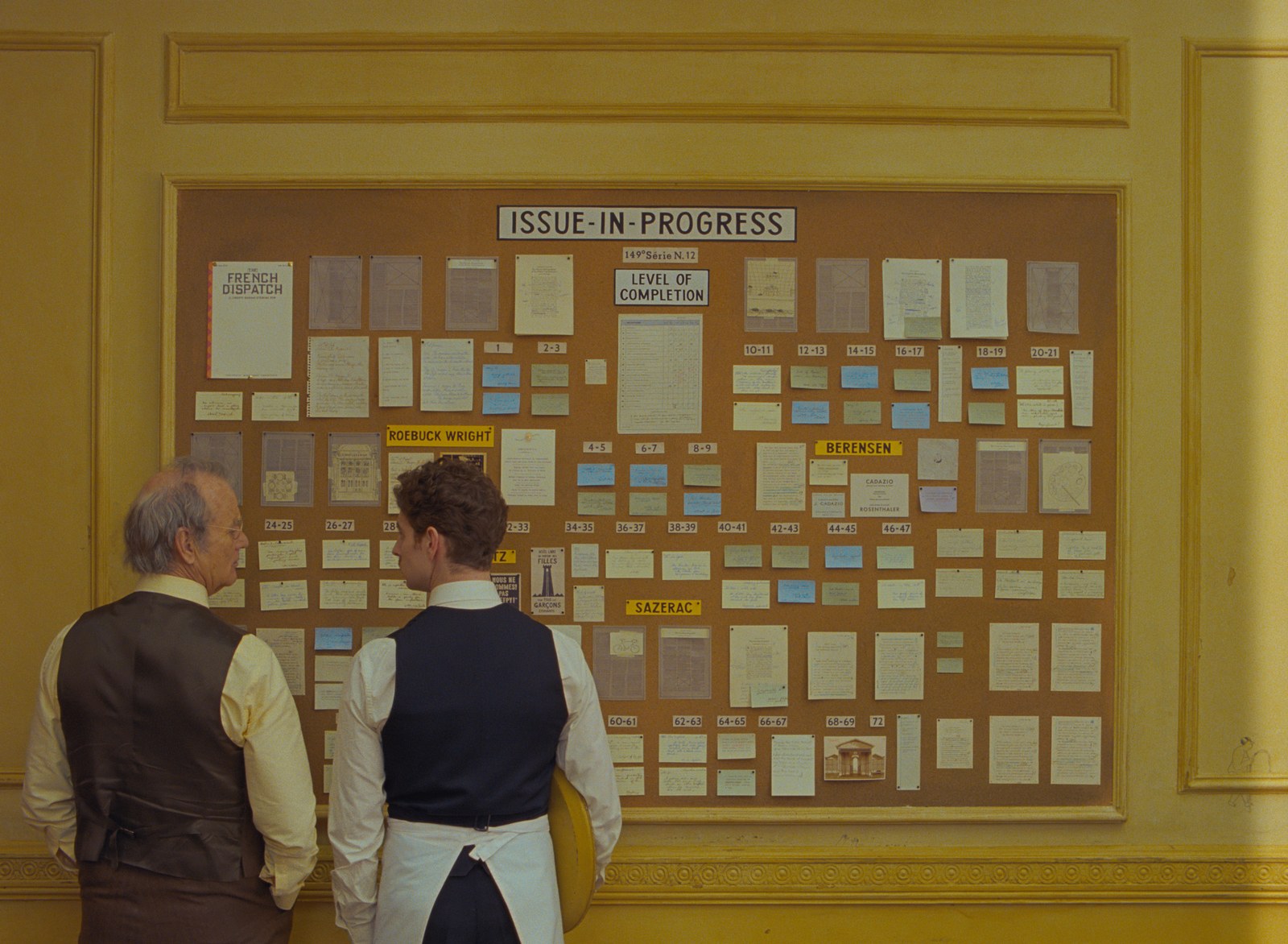
In The French Dispatch where writing is in the foreground, how was the creative process to develop the unique typeface that represents an iconic yet invented magazine?
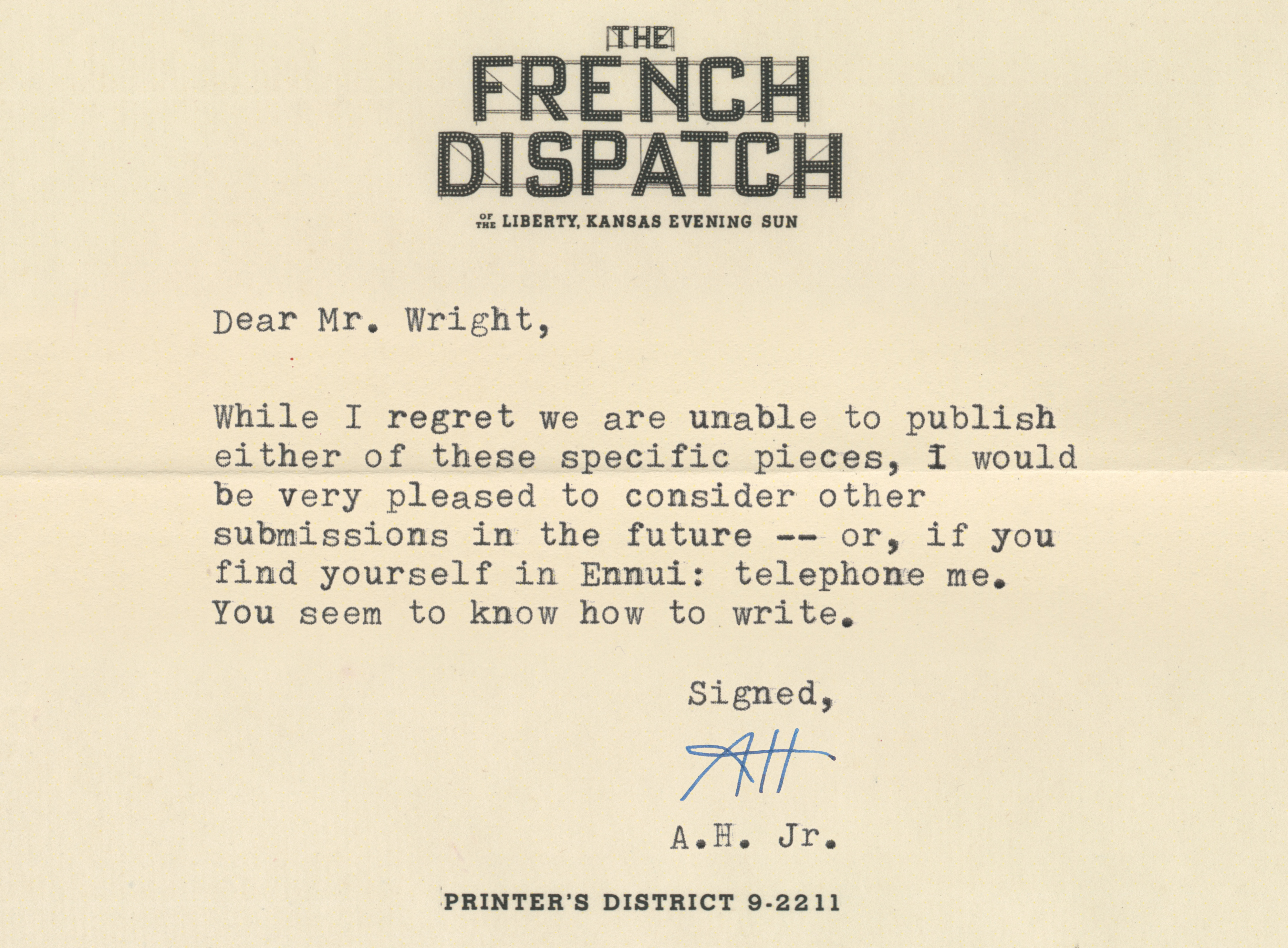
The title for the masthead of the magazine comes from the facade of the building where the writers’ offices are located. We borrowed the look from a 1912 photograph of the Galeries Lafayette building in Paris.
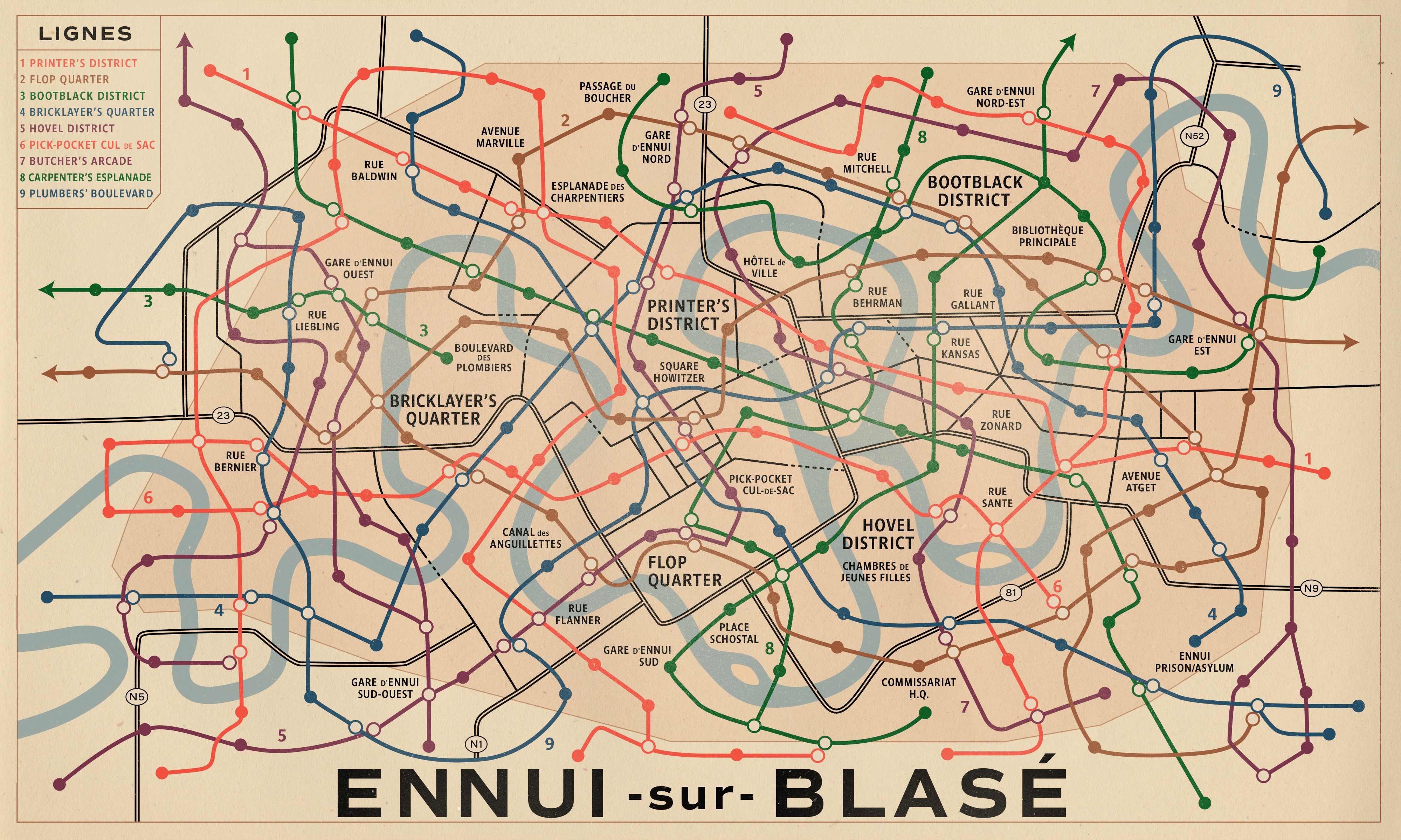

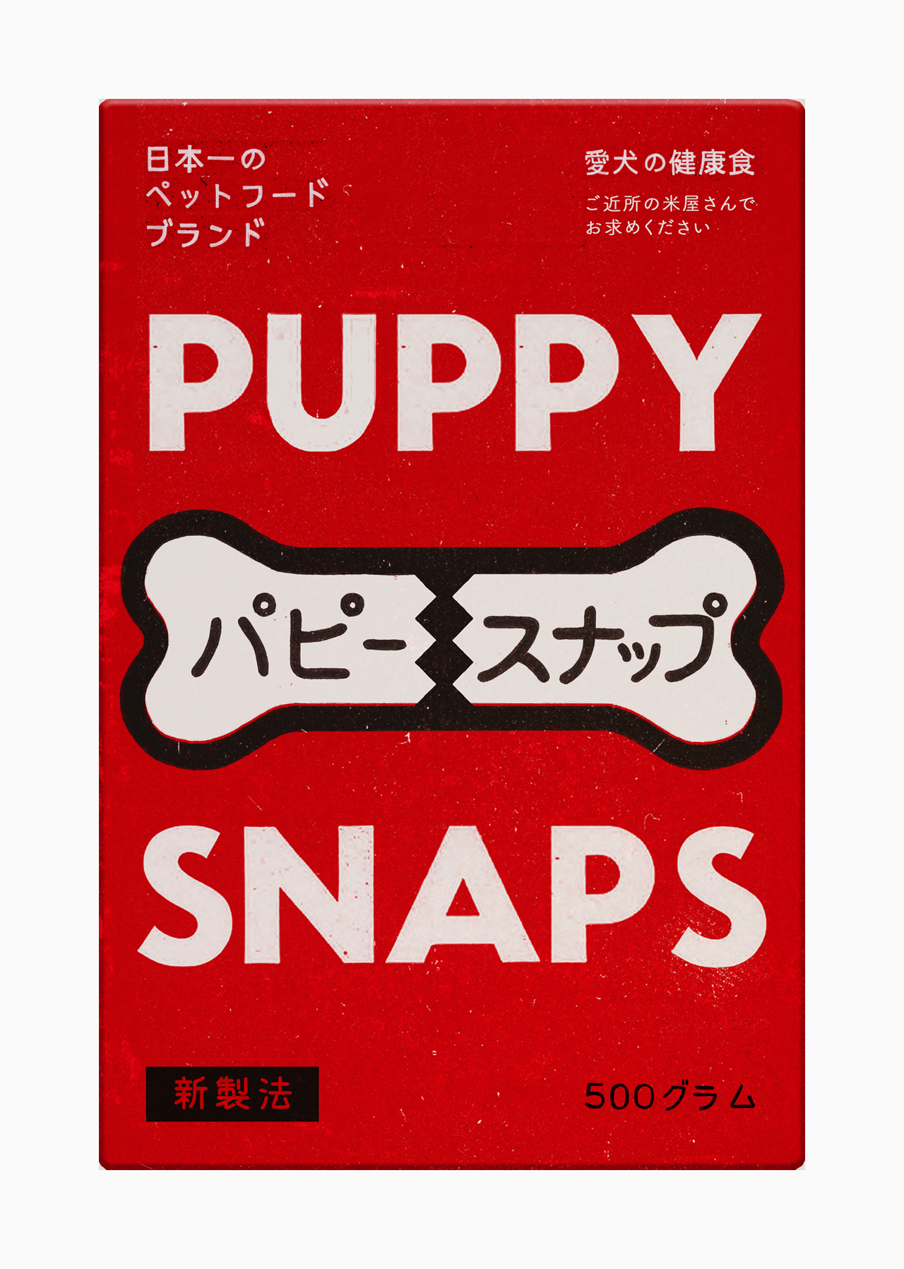
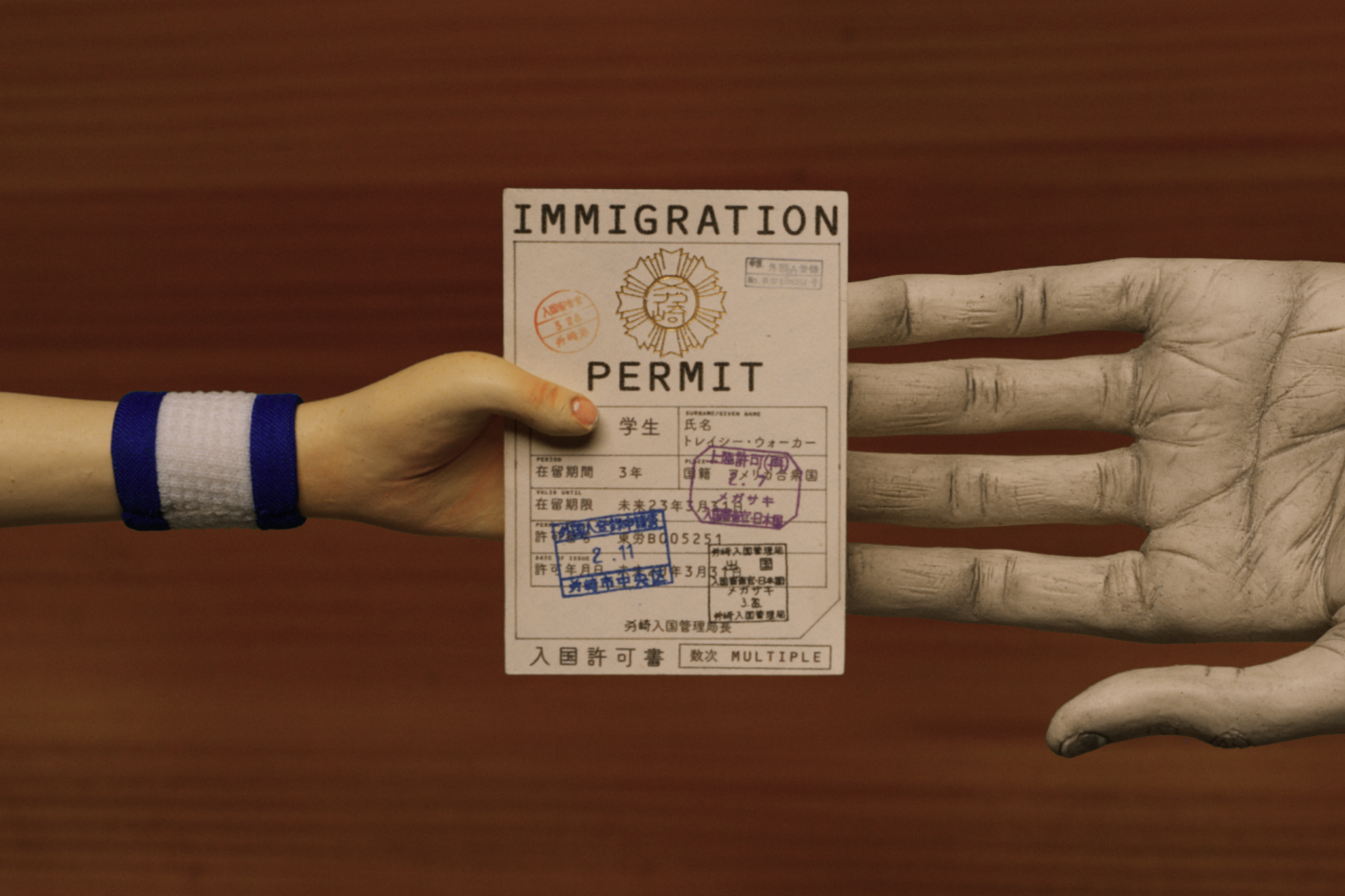


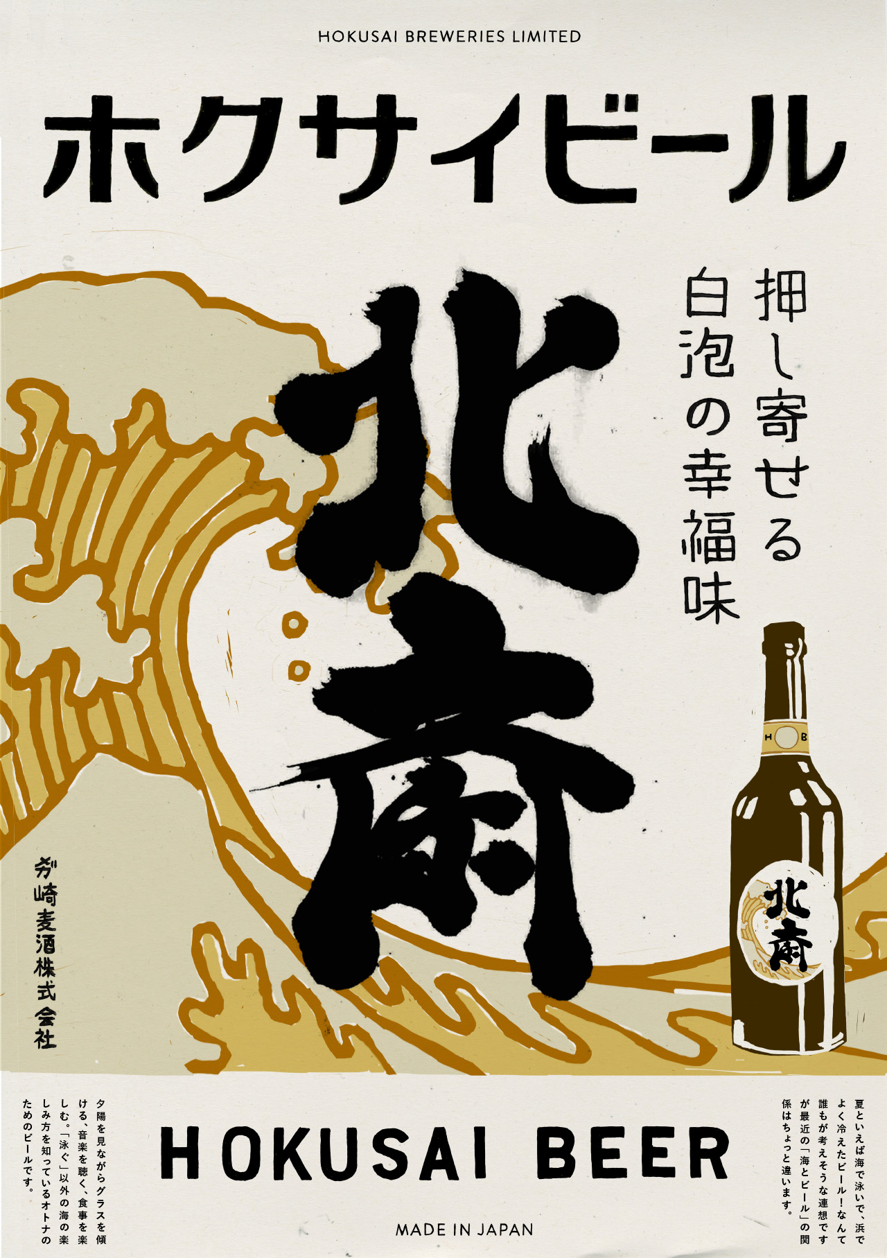
The creation of such peculiar marks and objects, which allow us to believe that the fictional settings of Ennui-sur-Blasé and Megasaki are real, is a symbol of your enormous talent. How do you complete your research to achieve that impressive degree of detail?
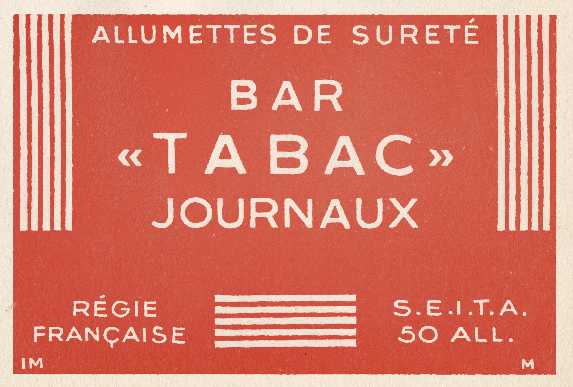
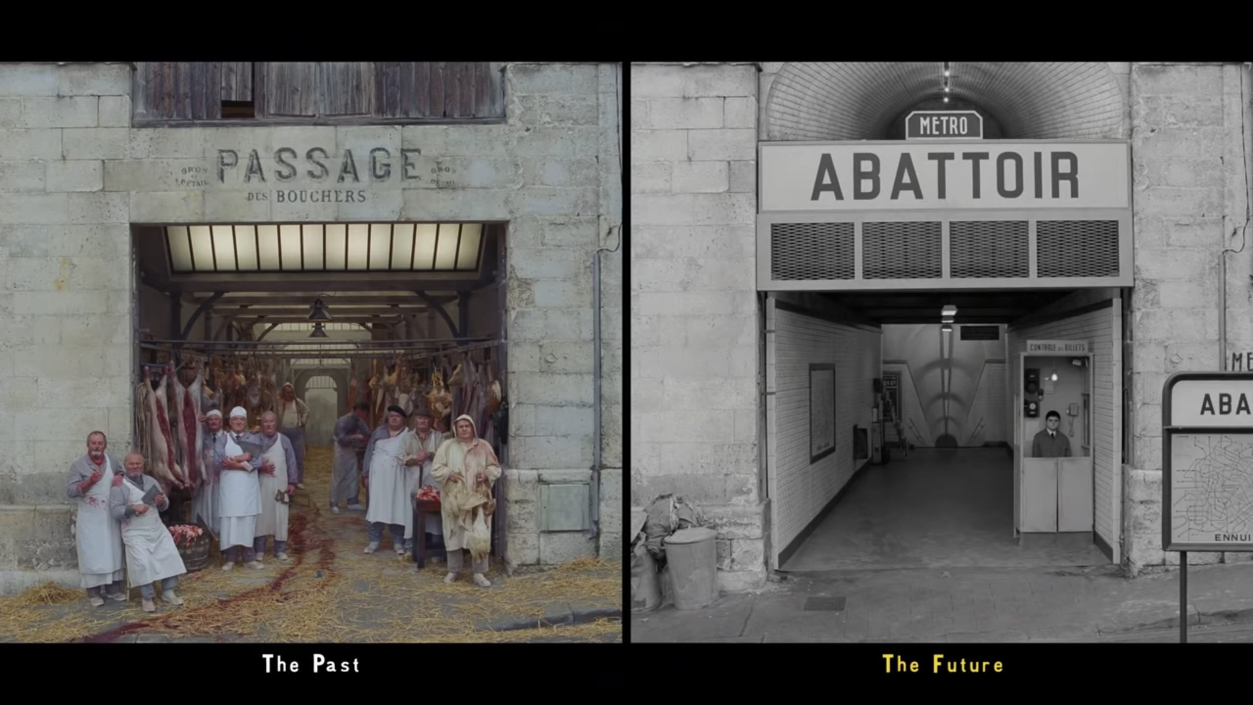
Whenever possible we try to base our designs on real historical examples and we spend a lot of time on research to have as much material as possible. Part of the skill is in identifying what’s interesting or significant in a reference and translating that into our own designs, folding them into our own story – for example it can be the fact that the letter “a” has a funny quirk in a hand-painted sign, or the kerning (spacing between the letters) is completely hand-done and unnatural, or the mistakes someone has made on a typewriter – these are all really valuable details.
What does it mean to see the established actors in the films you have worked interacting on set? Do they ask you to keep any of the objects they find?
As graphic designers we don’t often get to spend too much time on set. What we create in the graphics studio gets handed over to set dressing or action props. Especially during the pandemic, the number of people allowed on set is restricted. I think sometimes actors do like to keep a souvenir, but it’s usually not a problem because we have to make multiple copies of everything in case something gets damaged during play.
As an illustrator have you ever considered developing your own comic book series?
I have not! It’s been a while since I’ve not really considered myself an illustrator. Illustration often plays into my work, and it’s an important part of it, but when it comes to key artwork we often work with external artists (like Javi Aznarez and Sandro Kopp on The French Dispatch). My focus is more on lettering and typography – I do think that one day I would like to start making my own fonts to be used in filmmaking.

Is there a great deal of creative freedom in creating the scenography for films, or do you have a high degree of supervision from the directors?
I’m not sure it would be accurate to say that I create the scenography for films. But in terms of graphics, it really depends on the director. Working with Wes is a very specific experience. He is much more involved in every part of his film (including graphics) than others, and he does need to see and approve everything that we design. For other directors, graphics are a much more minor detail. It can be difficult at times but ultimately very rewarding because you know that a lot of importance is being placed on what you’re creating, and how it contributes to the storytelling.
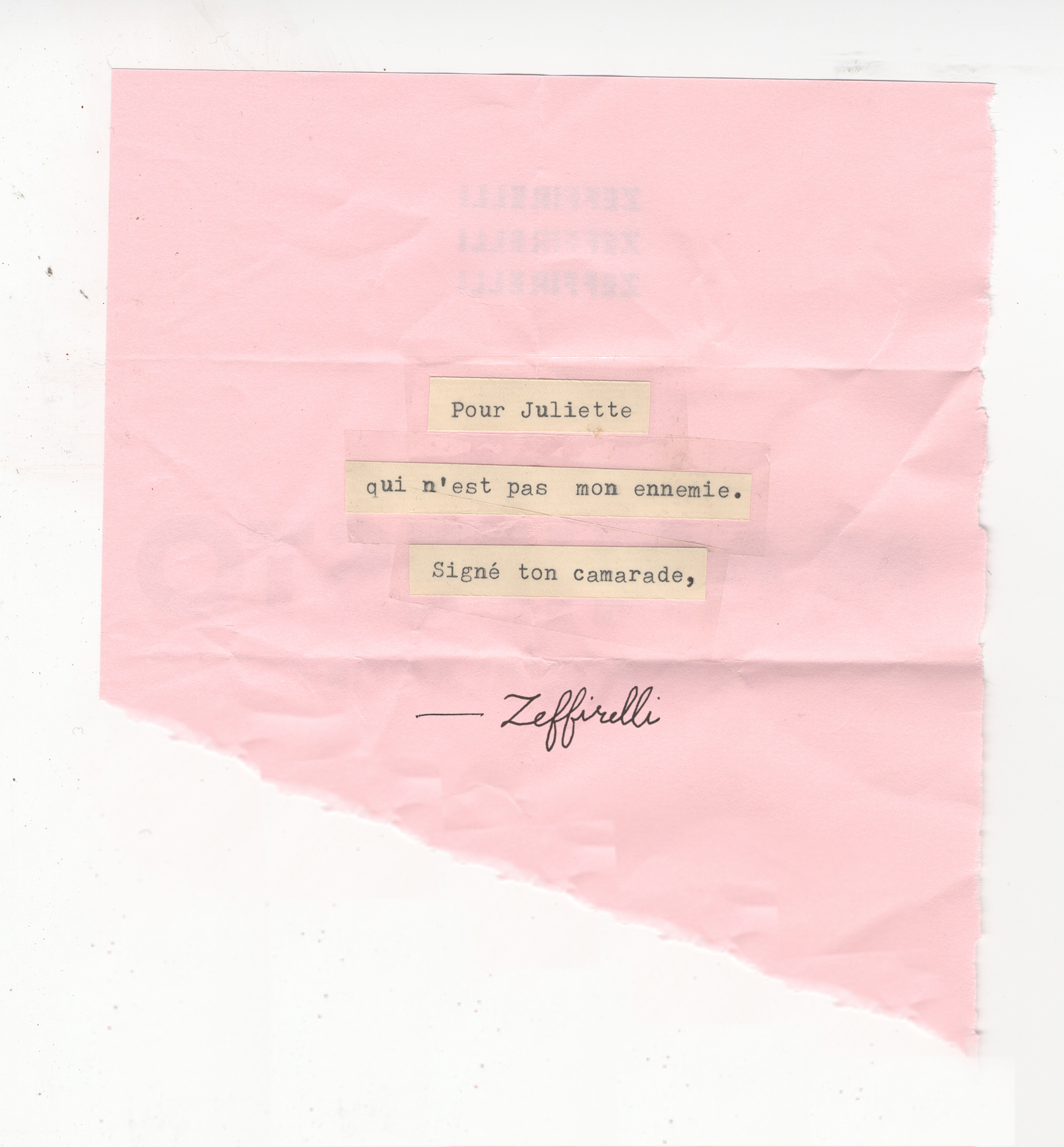
“Trial and error” is very common in design. And every millimeter counts. What can other designers learn from your experience?
I’m not sure what other designers can learn from my experience – I think we all tend to learn from our own – but I did learn that creativity is transferable, and sometimes a different industry (for me, the world of filmmaking) can present opportunities that you didn’t know existed for you and your specific skill set. I was really pleasantly surprised and now I feel comfortable in both the worlds of visual identity creation and graphic design for films. I always wanted a job where I could travel, and though it can be difficult to be away from home for months at a time, each time I go on location I feel as though it’s a new adventure.
The above interview to Erica Dorn was published on pages 6 to 15 in The Birds first chapter of FITA Magazine Vol. III / Star Portraits dedicated to the city of London.

